Recommendations for combined ad
- Meaningful long headline
- Illustrative images without text and logo
- Images that can be cropped
- Images without excess edges
- High quality logo in the right size
- Accurate targeting
1. Meaningful long headline
The long headline must make it clear what you are offering, as it is often displayed as the main message without a description. If you just copy in the additional Headline 2 from the ETA of the ad, the ad will not work.

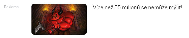
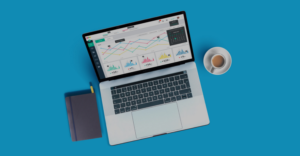
2. llustrative images without text and logo
Images without text have two times higher CTR because they do not cause “banner blindness”.
3. Images that can be cropped
The main object should be centred and aligned in the photo/image so that the image can be cropped by about 7% on the sides.

4. Images without excess edges
Use graphics that cover the entire image space.
5. High quality logo in the right size
- Choose the logo size that most closely matches the proportions of the sides of your logotype and enter this logo.
- Do not enter a rectangular logo in a square area and the other way around.
- The logo image should cover the entire graphic area without unnecessary borders.
- The recommended size for a rectangular logo is 1200 × 300 px and for a square logo we recommend 1200 × 1200 px.
6. Accurate targeting
If you have a limited budget and your product isn’t really for everyone, don’t just target the www.seznam.cz location, but specify targeting with relevant interests that your customers have.