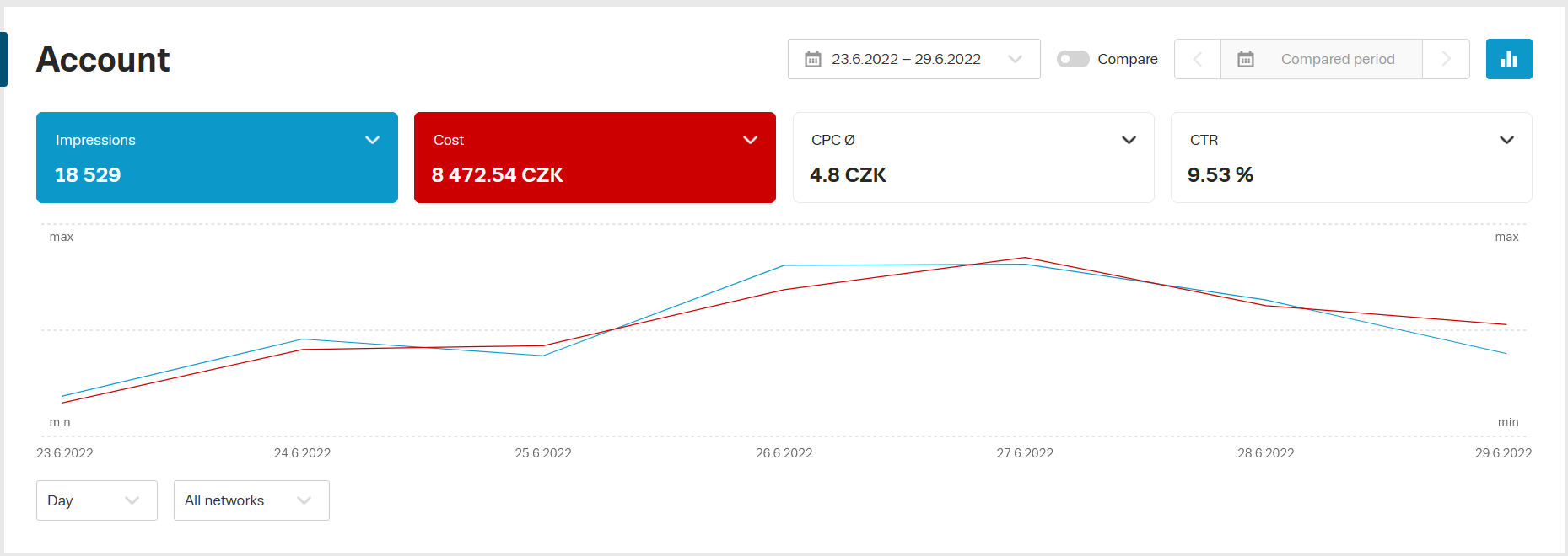
The Graph
Using the graph, you can easily see the progress of your campaigns.
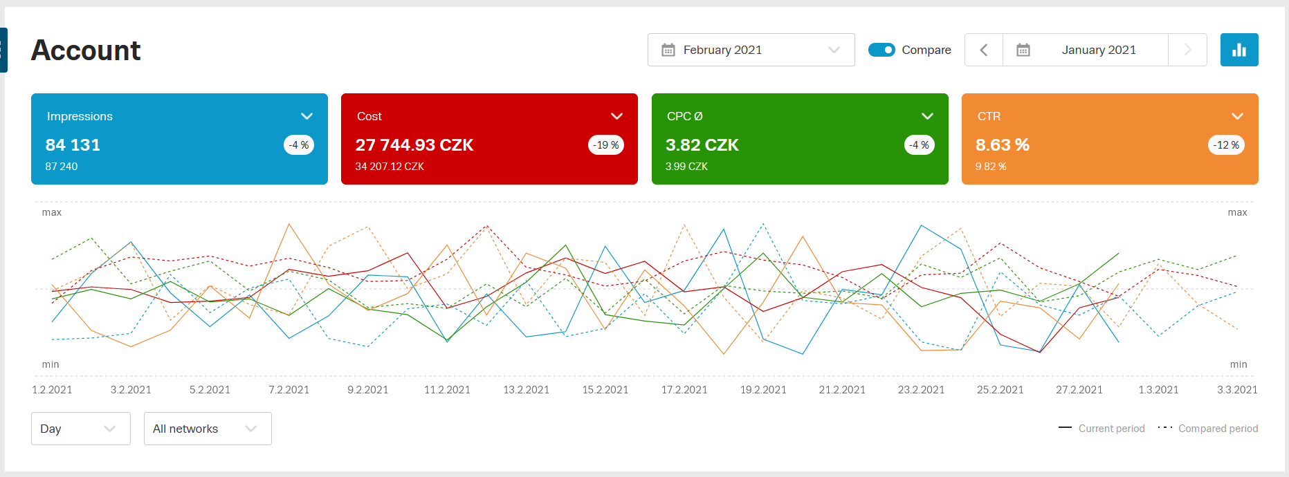
Comparison of periods in the graph
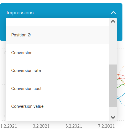
You can compare up to four metrics and see their trend in the graph at the same time. You can turn on or off the curve for a given metric in the graph by clicking on the related tile above the graph.
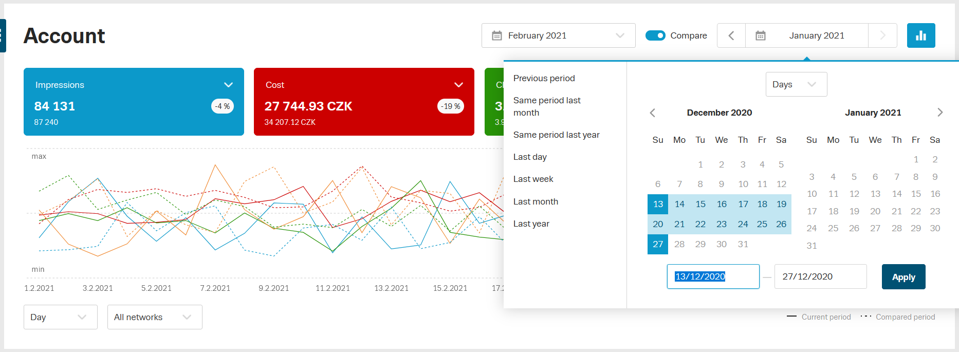
The compared period also has options for predefined “quick select” periods. Such as last day, last month, last year and more.

The user can set their own period. Using the calendar and marking the days of the month. The selection can be simplified by switching the granularity in the calendar – days, months or years.
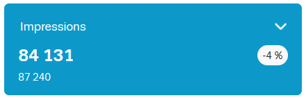
The overview tiles also show the percentage difference in the compared period.
You can switch metrics within the tiles, you can also choose which metrics you want to see each time you log in to your account. The system remembers the settings, you will always see the last viewed metrics when you log into the account or when you browse multiple accounts you manage.
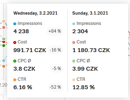
The graph “tooltip” allows you to compare individual days in a period.
What the graph can’t do (yet)?
- The graph does not yet reflect the filters set in the statistics below the graph.
- It is not available in the Age tab.
We believe that the modified graph will speed up your work when analysing campaigns performance.