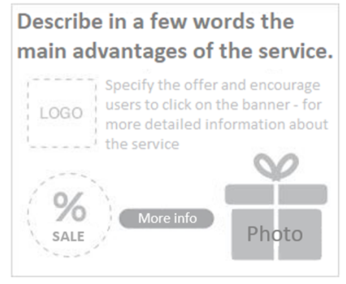
Recommendations for banner advertisement
Before launching graphic advertising
Plan a comprehensive banner strategy where you evaluate different goals.
- Visibility – enhancing brand awareness (increasing).
- Demand generation – introducing a new product or service.
- Sales – discount promotions, retargeting.
- Reminder – thank for purchase, upselling.
Other things to consider before running a display ad:
High quality offer
- Only a quality offer will trigger a proper response. Select the most attractive products that will attract potential customers.
- However, always provide truthful information!
Strong and clear communication
- Users visit websites for their content, not because of their advertisement surface. Therefore, customise the design of your banner.
- Attract the user’s attention with a banner in the first 2-3 seconds.
Picture or animation (GIF)?
- The format of the message should not take over the content of the advertisement. Less is sometimes more.
- In general, we recommend using a rather static form of advertising. If you choose to use animation, keep the main message clearly visible during the entire animation.
- The length of the animation is not limited, however we recommend not to exceed 30 seconds.
- Use the most effective banner formats.
Call-to-action button
- By using a call-to-action button, you can achieve a higher click-through rate and thus a greater chance of convincing users to make a purchase on your site.
- Try to include some advantage.
- Think about the banner from the customer’s point of view. For example, try to use “I want 15% off” rather than “Register here”.
What should you write on the banner?
- In the ideal case, the customer will find out: WHY should he click? WHAT does he get?
- Example: save up to CZK 30,000 a year on insurance.
- Say the one most beneficial thing. The message must be clear and written in sufficiently large letters. Remember that you are not selling just a product, but the benefit it will bring to the customer.
What actually works?
- verb (does action)
- call to action (save money, lose weight, win etc.)
- question (Why don’t you live in your own apartment? Do you exercise with no result?
- price, amount of discount (numbers)
- Words: Free, No fees
Pictures
- Choose the high-quality photo that best represents the product/service.
- Use crops, highlight details.
Product name and its contribution
- Use the shortest name possible, which appropriately describes the product/service. Be careful of giving too much information.
- Symbols and associations are worth using.
During the campaign
Banner evaluation and optimisation
- Always keep in mind the goal of your campaigns.
- Example: if you are interested in performance, prefer banners that bring in more orders instead of banners with high click-through rates (CTR) when testing
- Evaluate banner performance only after sufficient amount of data has been collected.
- Work with the frequency of ad impressions per user. We recommend a lower frequency for banners than for text ads.
Banner testing
- Show multiple different banners to users. They won’t get used to the graphics and stop noticing the banner.
- If one of your graphics performs significantly better than the others, create more similar banners and keep testing.

